Testing responsive websites
You are finally able to test your new responsive website but don’t have hundreds of devices to make sure that it looks great everywhere. You could resize your web browser but this isn’t good enough for either mobile or very high-resolution screens testing (e.g. 4K or ultra wide resolution displays).
Here is a very short video showing how to preview your website when viewed on any screen; in this case, at a resolution of 2560*1080px but this can be used to emulate small devices too and can emulate touch events, network throttling etc.
Short video
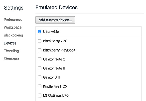
5 Steps to add your custom device
- 1. Open the dev tool (right-click > inspect)
- 2. Click on the toggle device toolbar button
- 3. Select “Edit” from the device list drop down
- 4. Click “Add custom device” and fill all fields
- 5. You can now select your device from the device list!
Feel free to post any questions you may have!
Source: External Link